Branding a vegetable soda
Garden Theory
2018
Role
Concept development, brand design, packaging design
About
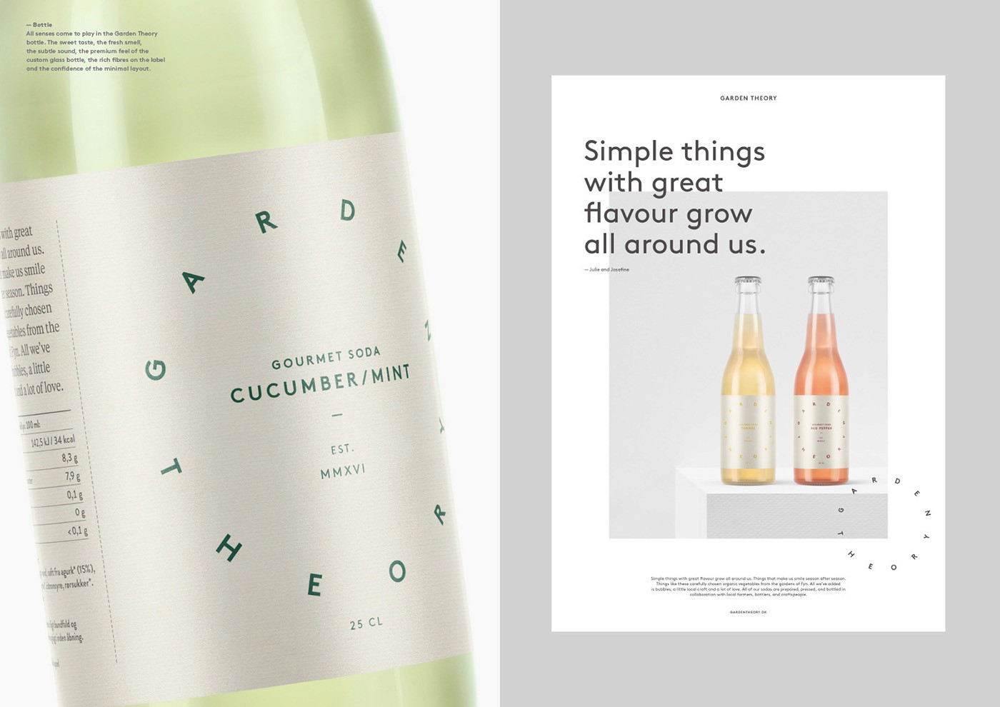
Garden Theory, a vegetable soda company, with sodas made from locally sourced seasonal vegetables grown on the island of Fyn, Denmark needed a visual identity. We set out to create a clean, simple and understated identity that would tonally and visually position Garden Theory as an challenger in the crowded soda category. We designed a logo symbolising year-round production with each letter representing a given month. Combined with a narrow and subtle color palette to identify flavours on the packaging labels. Resulting in a visual identity that allows the brand to position itself as the left-field sustainable challenger int the upper-premium category of sodas.
Branding a vegetable soda
Garden Theory
2018
Role
Concept development, brand design, packaging design
About
Garden Theory, a vegetable soda company, with sodas made from locally sourced seasonal vegetables grown on the island of Fyn, Denmark needed a visual identity. We set out to create a clean, simple and understated identity that would tonally and visually position Garden Theory as an challenger in the crowded soda category. We designed a logo symbolising year-round production with each letter representing a given month. Combined with a narrow and subtle color palette to identify flavours on the packaging labels. Resulting in a visual identity that allows the brand to position itself as the left-field sustainable challenger int the upper-premium category of sodas.


Project was conducted while working at Bold Scandinavia, Copenhagen office.
Design: Emil Boye, Richard Hormia, Muggie Ramadani
Project Manager : Lea Halby
Account Director: Anders Holm Larsen
Creative Director: Bold Scandinavia, Copenhagen